
Hawaiian Shirt Project
Introduction
In this project, we were asked to use Adobe Illustrator to create a unique pattern and then apply that pattern to a Hawaiian shirt that was traced from a template layer using the pen tool. In addition to applying this pattern to the shirt, we were also tasked with creating buttons and an Aloha style label for the shirt, presenting the final product in a layout that included the finished shirt, a pattern swatch, the button, the label, and the shirt name and creator.
Materials
Procreate (Initial sketches and brainstorming)
Adobe Illustrator
Creative Process
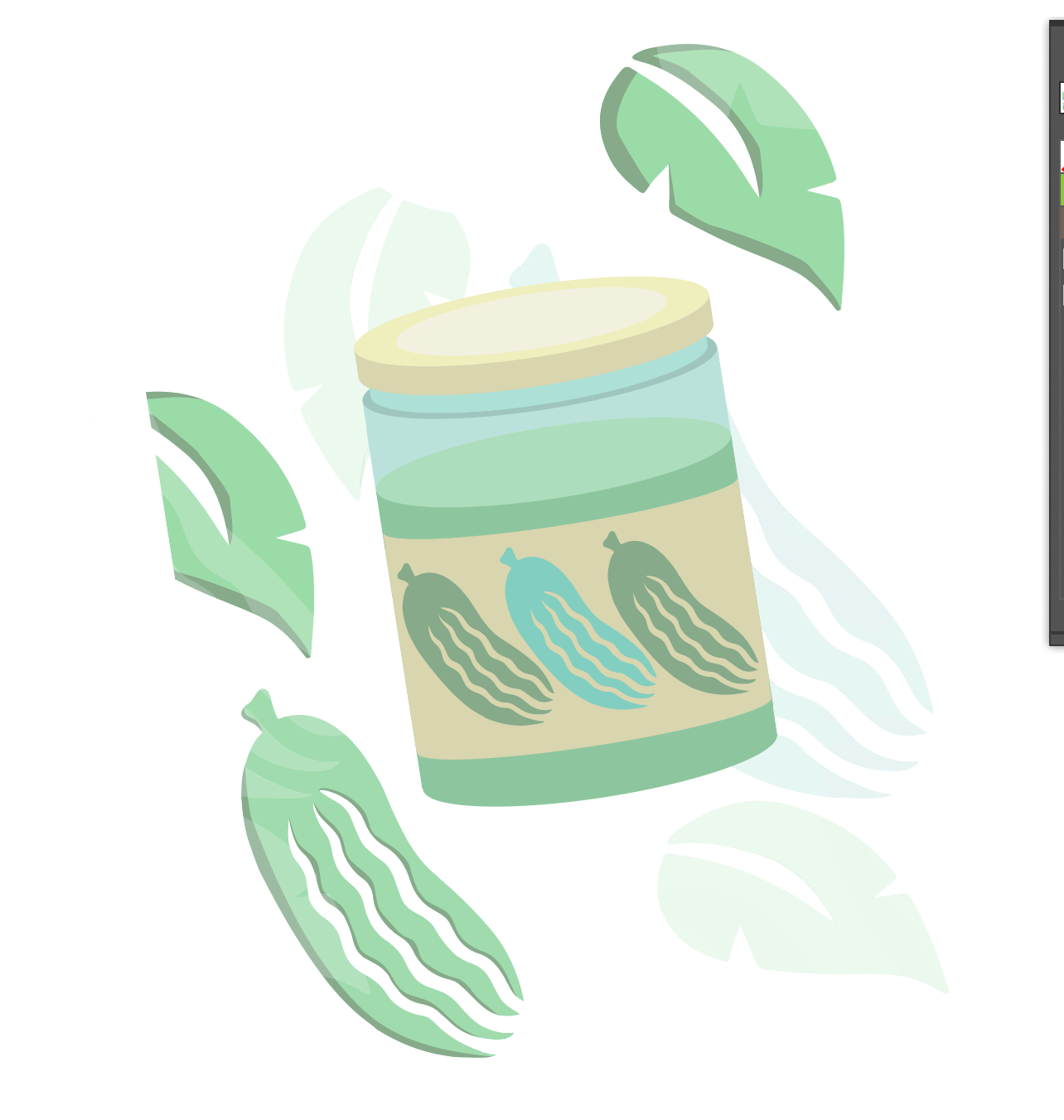
Initially, I was inspired by a logo that I had created for DESN 9177: Principles of Design—a course that I took through George Brown College’s Continuing Education program in the Winter 2021 term. The logo is for my hypothetical design studio, and the image is a stylized pickle, a reference to a nickname I was often called in childhood. The tagline that I chose at the time was “because we think you’re a pretty big dill.” This project was to be completed entirely by hand, and I had always wanted a chance to push this project further by experimenting with it digitally.
I started off by opening the image on Procreate on my iPad and used the monoline calligraphy brush to play with and rearrange elements. I wanted to stick with the green colour palette, but I wanted multiple elements that went together. Ultimately, I decided to keep the original image of the pickle and add a drop shadow. I also made a pickle jar with three pickles on the label. Then, inspired by other examples of Hawaiian shirts that I either own or saw as examples online, I added two leaves whose styles matched the pickle. Finally, I decided to create a watermark-type background by adding two leaves and the pickle into a background layer behind the rest of the image, and reducing the opacity so they were clearly background elements.

Production Methods & Workflow
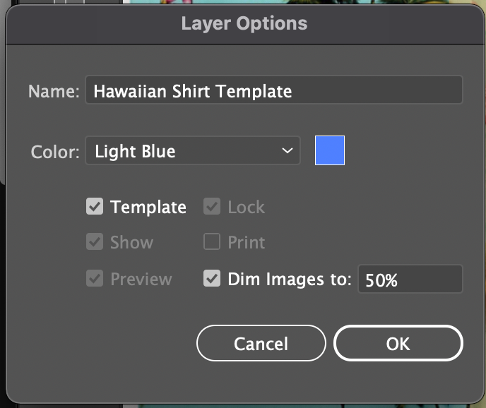
First, I created a new file placed a picture of a Hawaiian shirt as a locked template layer in Illustrator. I dimmed the image to 50% to help me see my lines better.
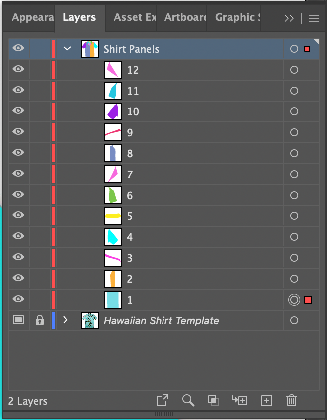
Using the pen tool, I traced each panel of the shirt, following the order outlined in this video. This strategy greatly simplifies tracing complex shapes because shared edges only need to be drawn once on the top layer on which they are visible.
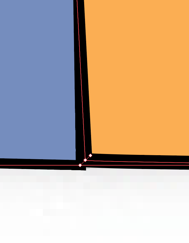
I used the width tool to make the stroke slightly wider in areas where I would expect there to be a shadow, assuming that the light source came from the top right. While zoomed in, I used this as an opportunity to make sure that the stroke looked realistic, ensuring that there were no sharp corners or mismatched edges.
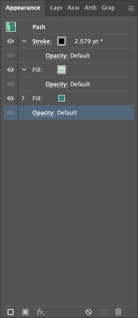
After creating my pattern, I had to apply the pattern to each panel. Using the Appearance panel, I applied a solid fill to the shirt, on top of which I applied the pattern. I made sure that the pattern was offset on each panel for a realistic appearance, and I used the tilde (~) key to rotate the pattern on the sleeves and parts of the collar.
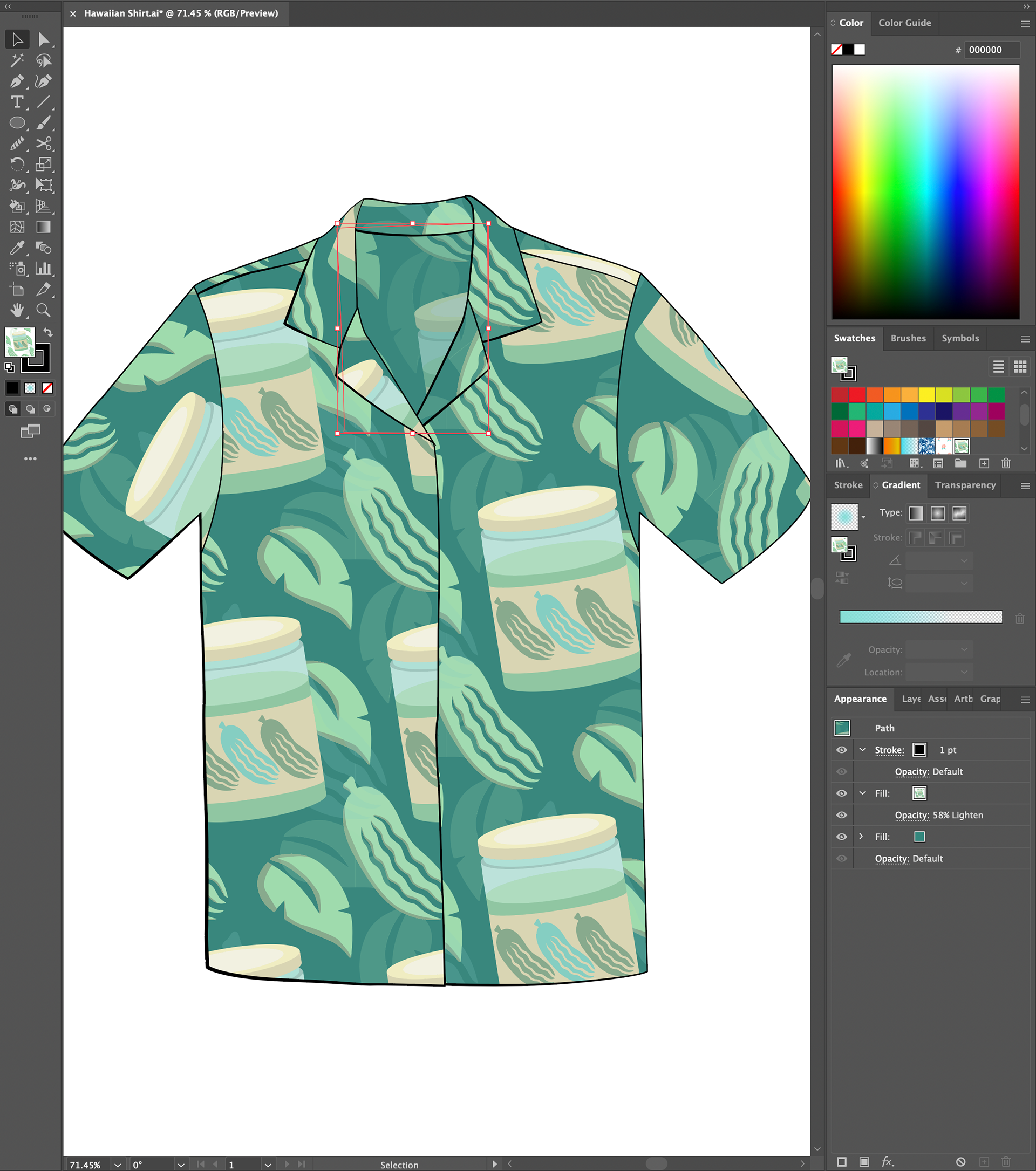
Part of the inside back panel of the shirt was visible, highlighted by the red rectangle. For this panel, I set the blend mode of the pattern fill to lighten and adjusted it to 58% opacity.
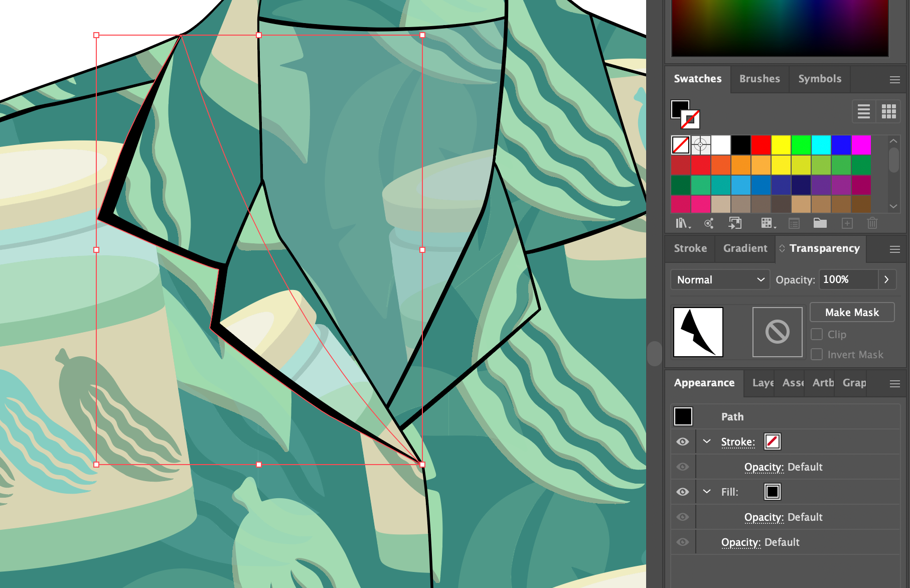
To create a realistic shadow behind the left collar pieces, I created a new layer beneath both components of the collar and used the pen tool to create a shadow, and filled the shape with black.
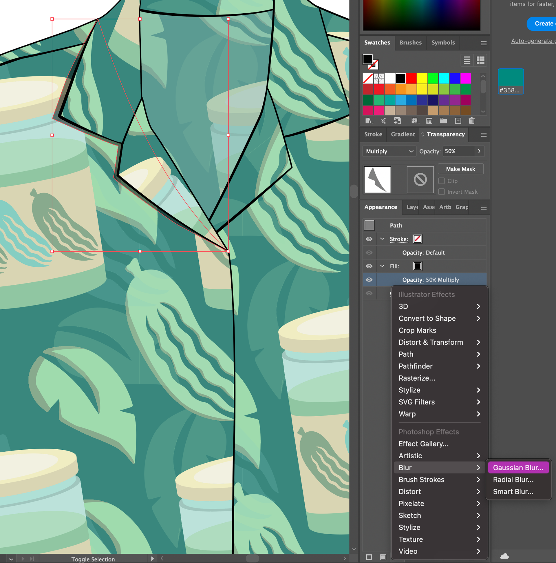
I set the blend mode to multiply and reduced the opacity to 50%. Then, I applied a Gaussian blur, as the sharp edges of the shadow did not look realistic.
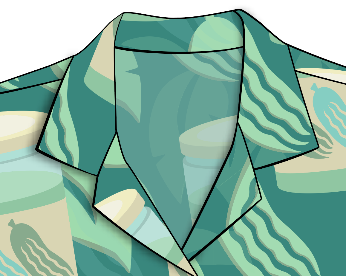
A closer look at the collar after the Gaussian blur has been applied to the shadow layer.
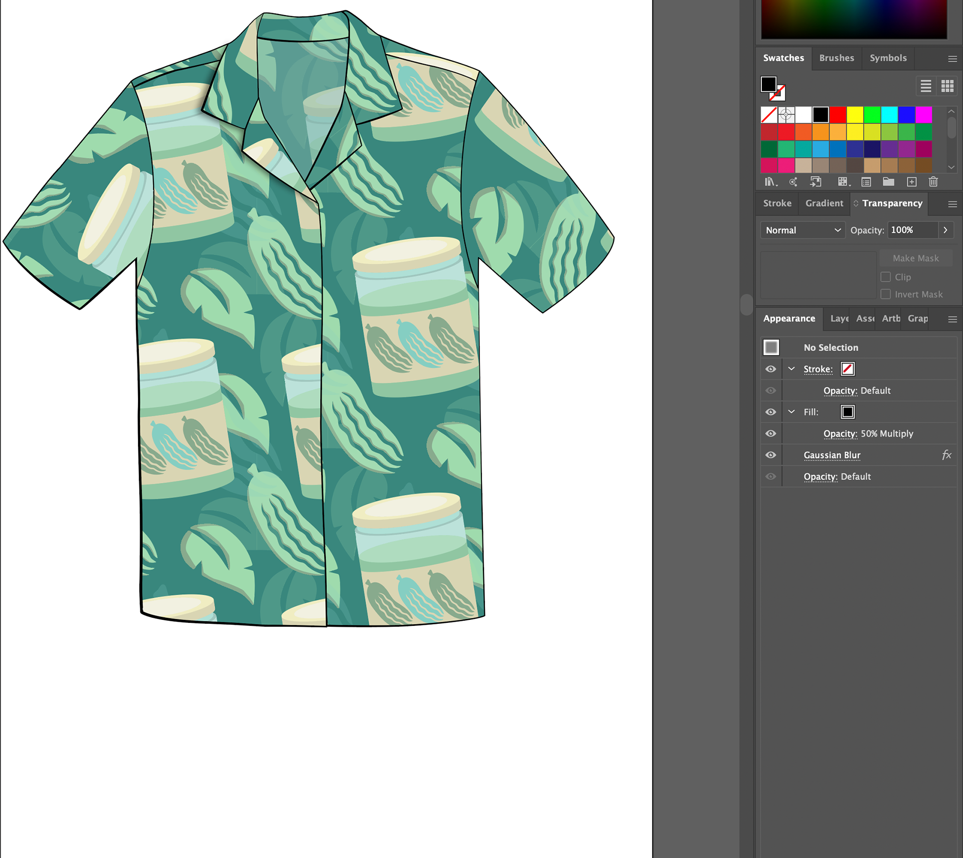
A zoomed-out look at the shirt after dimension was added using the width tool and shadows.
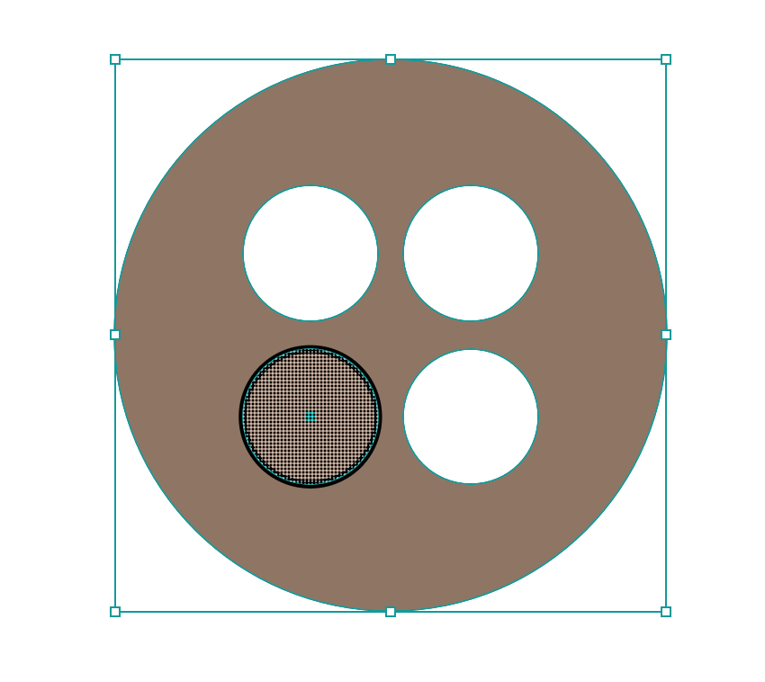
My next step was to create the button. I used the ellipse tool while holding down the shift key to make a a perfect circle, and then added four smaller circles inside as shown for button holes. Using the shape builder tool, I cut the button holes out of the button. Just creating a white fill would not allow the shirt to be visible through the buttons once they were placed on the shirt.
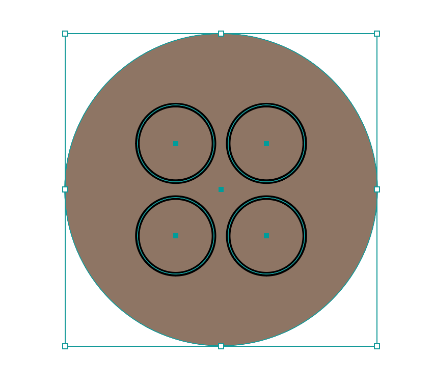
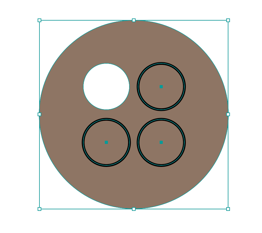
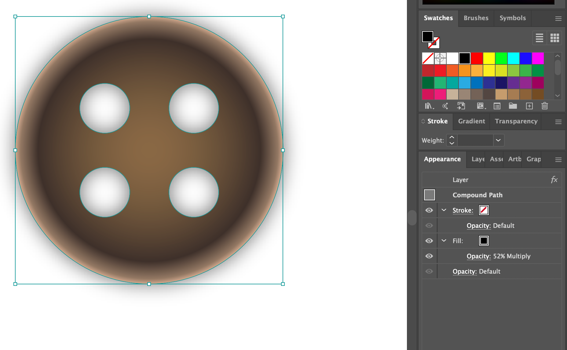
Using gradient fills, I created dimension in the button to make it look more realistic. To add to this, I created a shadow layer beneath the button layer, applying a gaussian blur and setting the blend mode to multiply at 52% opacity.
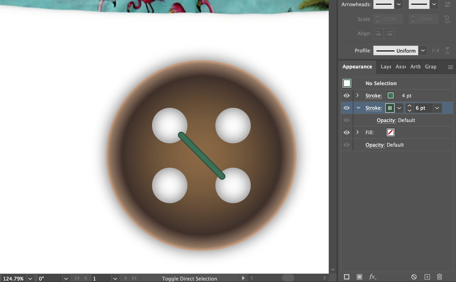
Next, I created my first thread using the line tool. I gave the stroke capped edges, and gave it both a fill and an outline. Later, I added thinner light-coloured strokes to the thread to create the illusion of three-dimensionality.
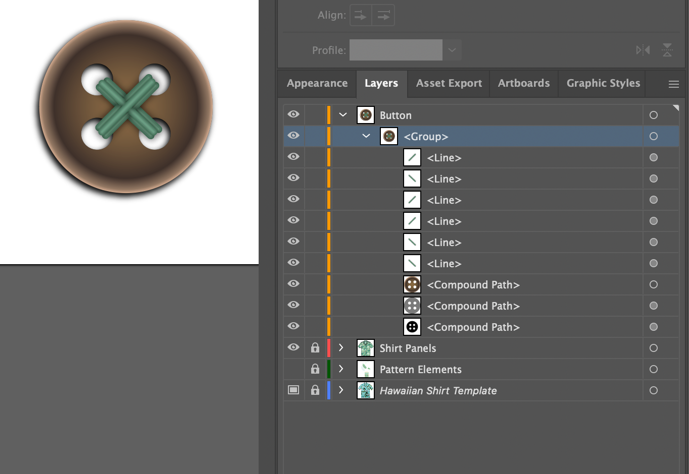
Once I was satisfied with my thread, I created five more copies and arranged them as shown in the layers panel.
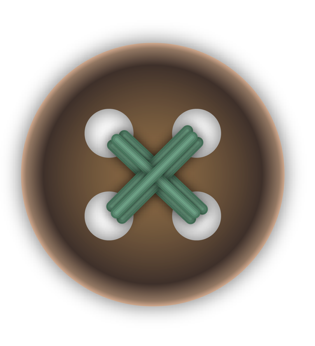
A close-up look at the completed button component. I hid the shirt layer, and placed my buttons on the same spots that the Hawaiian Shirt Template had its buttons.
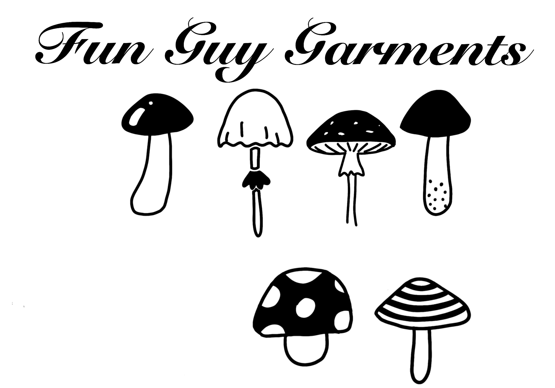
For my shirt label, I decided on the company name "Fun Guy Garments", a play on words since my illustration was several different types of fungi. I experimented with a few script fonts and rearranged the mushrooms that I illustrated until I was satisfied with the final product.
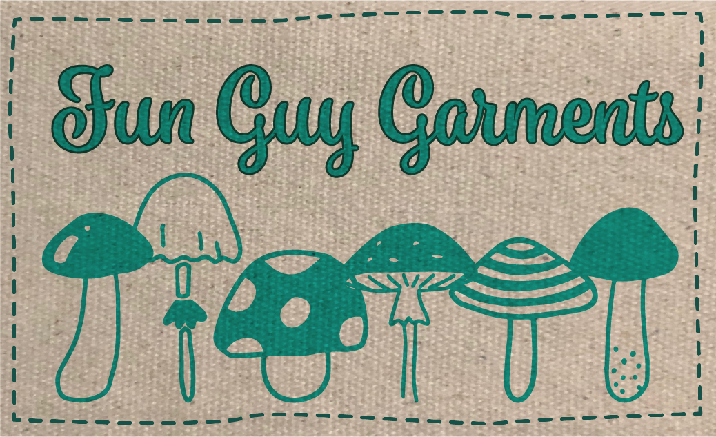
I added finishing touches to the shirt label. The fabric of the label is a photo that I took of a canvas bag that I own. I created dashed lines with capped edges using the stroke panel for the threads. For the company name, I added a darker stroke to outline the type and add emphasis. For both the type and my illustration, I set the blend modes to multiply so that the texture of the label's fabric would be visible through these elements.
Final Work
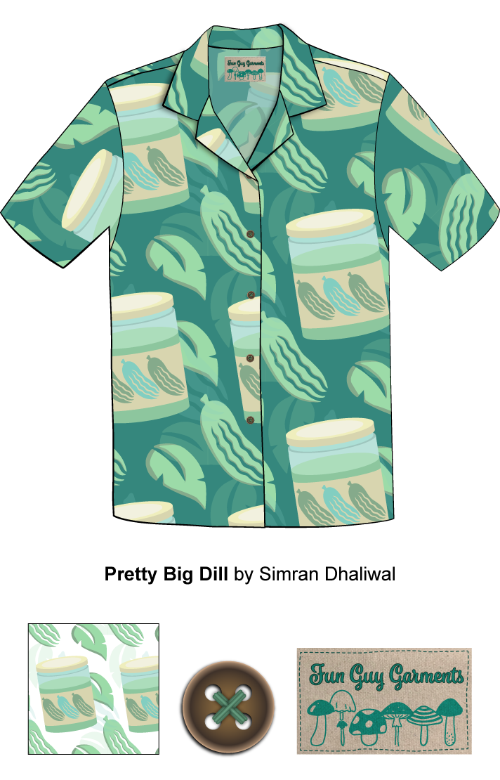
I arranged my pattern swatch, button sample, and label sample on the bottom of the artboard. I added my shirt name and the creator's name (that's me!) beneath the shirt in an Arial font. I actually missed an instruction on the font size for this part of assignment--but hey, it happens. I also realized that the inside panel of the shirt did not have the pattern flipped, so I fixed that.
Conclusion
I can honestly say that I thoroughly enjoyed this assignment. This was the first assignment where I felt that I was using some of the tools I had little or no experience with, because I had never had an application for them in the past. I enjoyed making the patterns, but I definitely grew frustrated at how hard it was to make the pattern look balanced but also not too tile-y.
After this project, I can honestly say that I feel like I have conquered the pen tool. I got into a good rhythm with it and felt myself working with it instead of against it. If I were to redo this assignment, I would definitely rotate the threads a little to make them look more realistic, but other than that and missing the step about the font size, I felt pretty proud of myself.
Thanks for reading and happy creating!
- Simran